Church Websites

I've looked at a lot of church websites, lately, collecting ideas for our new website. And after listening to the volunteer who is doing this for us (she's a pro...we're so fortunate!) I am beginning to understand what works and doesn't work about church websites.
We're redoing our website in part because we originally built it for our own internal use, thinking that volunteers would check bylaws, read the newsletter, and that sort of thing. But it has become clear that our "insiders" prefer their usual way of getting information and the people who check our website are visitors, people looking for sermons, and other "outsiders." As one who has prowled websites of churches in various denominations looking for those kinds of things, I can start with my pet peeves.
- Do you know how many church websites don't give their city name? Nice website, but I have NO IDEA where you are, First XX church, St. Somebody's, etc.
- Links that don't work are the scourge of the web in general. The first questions after "can we make this page," should be, "who will maintain this page?"
- Nobody but you knows what UU, MYF, OWL, etc. stands for, and lots of people don't know what words like "ministries" and "stewardship" mean. I spent almost 15 minutes looking through a church website for an RE article I remembered seeing because there were no obvious menu links until I finally realized that this church uses the phrase, "family life", to mean "programs for children." Most people, especially most of the people we UU's tend to appeal to, HATE feeling stupid or not "in the know." Pay somebody not in your church to go through your website and point these things out to you. (and have them go through your order of service and listen to your announcements while they are at it.)
A few of other things I've learned.
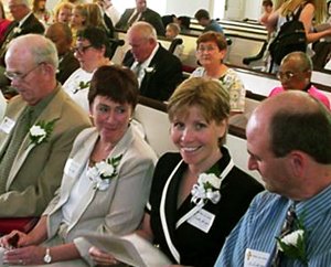
- Unless your building is a landmark in your town, you don't need lots of pictures of it. Very few people are attracted to buildings. They are attracted to people, especially people like themselves, and the easiest way to communicate to lots of different kinds of people that this is a church for people like them is to pay attention to the diversity in your pictures. But they have to be the right kind of pictures. The person who is re-doing our web page has very specific instructions for the website photographs. They must be pictures of several people doing something together, at least one of whom is looking at the camera. She found such a picture (above) to demonstrate to me how incredibly enticing it is, and since then I have gone through my church website searching cringing at the terrible pictures most churches use, which are either groups of persons doing something but you can't tell what it is or see their faces, which is off-putting, or are posed with everyone staring at the camera (something most people can't pull off), which is also offputting. My website designer says that good website photos are staged. They just don't look staged.
- One of the things people are going to do is check the DIRECTIONS on your website from their CELL PHONES. So your website has to automatically resize itself, and the directions should be prominent. And if it's not completely obvious where to park and where to go once one is on the property, you need those directions, too.
- Another thing people are going to do is PRINT THE MAP. My website designer has actually designed the "map" page with a street map, a campus map, the service times, phone numbers, and a "we'll be so glad to see you," message. It's designed to be printed out, and it has everything a person would need. Neat, yes?
- She has also emphasized that our Ministry to Newcomers begins, not when they walk in the door, but when our site loads on their computer. She wants them to leave the site feeling like they spiritual needs, not just their informational needs, were met. Much of that will be done with a couple of paragraphs from the minister...and this minister is puzzling over that assignment. More on that tomorrow
[church websites]


<< Home